My birthday present to myself this year was supposed to be a blog overhaul, for which purpose I enlisted the assistance of the amazing Izzy. But I’ve been stuck for days in an ever-worsening spiral of indecision about a new banner – do I go cheeky? serious? cheeky-serious (cherious?) urban-hipster-doofus? tweedy academic? black-beret-scotch-sipping beatnik?
WHAT is the aesthetic of Her Bad Mother?
I’m having a blog identity crisis, on a par with bangs or no-bangs, skinny jeans or no-skinny-jeans, tat or no tat. What look is right for me?
I’ve been seriously tempted by this banner (design by Iz)…

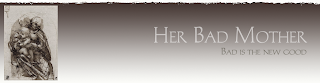
… but just haven’t been able to take the step of committing to it (the image on the left, by the way, is a Da Vinci sketch, Virgin and Child, which, although wonderful, is maybe not perfectly reflective of the HBM ethos.)
I’ve also toyed with using one of the many spectacular WonderBaby images…
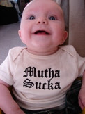
… like this…
…or this.
But I JUST CANNOT DECIDE.
I know that most of you are currently out sipping Memorial Day margaritas right now, but please. Help. What sort of look should I be going for? What’s gonna say, this is the blog of Her Bad Mother and it ROCKS?
*******
The other thing that I want to do in this blog renovation is set up a list of favourite posts, a sort of greatest hits list. But do I go with my favourites, or do I go with the ones that have been most popular, judging by comments or awards or whatever? (Because, interestingly, what I like most and what you like most – judging by volume of comments, which I know isn’t necessarily the most reliable indicator – are not always the same). One of my recent favourites disappeared into last weekend, as weekend posts sometimes do, but it is a piece of writing that I’m particularly proud of. Another favourite was well-received, but it’s a particularly intimate post and one that I’m reluctant to wave around while shouting me-likey-likey! And another is really just a silly, off-the-cuff post, but one of the very few of my own that I really think is funny (notwithstanding the phallus posts.)
So how does one decide? Should it be my favourites, no matter their character? Or should it just be the popular posts? Or is it really just so much more grandstanding to flaunt old posts (hey! looky here! my ass looks good in these posts!)
Or is it really just so much more grandstanding and contrived insecurity to be asking for help in sorting out how to revamp one’s look? OMG am so fat am such a bad mother should I not be wearing skinny jeans should I lose the bangs but isn’t my forehead just too big omg have you seen my ass what do I do? (preen preen spin pose affect worry pose preen)
Maybe. Or maybe I’m just aesthetically stunted and indecisive and overly-reliant on peer support in making blog-altering decisions.
Let’s go with that.
HELP.


{ 75 comments }
← Previous Comments
Go with your faves if you want to do a best of. Ultimately, isn’t what you think best the thing that matters? And do comments=quality, anyhow. I’m not thinking so.
And I think you like cheeky, myself. But that’s just my impression!
I vote the babe at CBGB – it feels like you to me.
So, when there is another baby, will you become “Their Bad Mother”? That will totally confuse me, since these days, I’m easily confused.
The banner decision is a tough one. I just went through it. Go with your gut. Whatever you choose, we’ll love, so you should love it first.
On the favorite posts, I say give a sampling of what your blog is about–introspective, intellectual, cheeky, hilarious, mother-worrier and mother-warrior; that’s how I see you. It’s more important that you represent how you see yourself. I think that type of list helps newcomers to your blog get a taste of what they might find here in the future.
I’m not sure about the design header, but for favorite posts you should use both your favorites and the most popular. It’s nice to get a little bit of both!
Iz’s design rocks, though for your image I think I’d choose Chagall over DaVinci. Or Rauschenberg.
I like the CBGB Wonderbaby…she screams “Bad Mother”.
I of course mean that in the best of all possible ways…
I think you should flaunt your favorites. I mean it is your blog right?
I like both of the Wonderbaby shots. Maybe something with both? I’m not a big help. Sorry.
Personally, I would go with Kermit. There has been FAR TOO FEW pictures of Kermit or muppets dancing around here. Think about it, muppet=tv=bad=BAD MOTHER.
It’s your blog- I think favorite posts should be your favorites. I agree with B&P, beware of the shiny bright lights of the commenters… be true to your voice and your vision..
Sadly, Binky, I’m pretty sure that Kermie is subject to all sorts of copyright. Otherwise I would TOTALLY be all over that. Him, and the phallus.
Thanks for stopping by my blog.
My 2 cents:
Mutha Sucka hands down. That SMILE!
and, always pick what YOU like … can’t please everyone, so you should just please yourself.
=)
I say go with your favorites and add a few of the popular ones if you like. By the way, I do love the idea of having a list of your favorites! I think it even tells more about the author, especially for new readers.
I like all your choices for the new look. I know how hard it is to commit, so good luck! But any of them will look great.
a google image search for “bad mother” turned up such gems as a pacifier adorning a cosmopolitan, a child flipping off the camera (Oooh! a new trick to teach Wonderbaby!), spaghetti on the wall, and the “bad mother fucker” wallet from pulp fiction.
If none of these images spark your imagination, then I think the tattoo idea might be a good one. And of course the pics of Wonderbaby are adorable.
The Davinci banner as is I find too severe. I love the image, but I think it needs to be juxatposed with a more playful font and colours.
What’s so kick ass about your blog is the mix of the academic-inspired writing, pop culture, and the forays into potty-mouth glee. It’s such an interesting combination, you need a banner/new look that reflects the complexity of your blog.
And your favourites should be your favourites.
Okay, I am not going to read the comments until after I post this, so as not to be swayed, but I really liked the first deisgn you showed by Izzy. A lot! Verrrry classy, edgy, low-rise but not trashy pants. I would hang with that design on the playground.
OK, I am laughing so hard right now. From recently becoming a “fan” I find it hilarious that you are so indecisive about this. I just assumed you knew you were the shiznit when it came to blogging and all bloggy decisions! I really like the first banner and I think YOUR favorite posts is (are?) appropriate…
Another vote for the CBGB photo. Fits your title best.
My 2 cents, for what it’s worth. I don’t know that a serious image like the Da Vinci sketch really fits you. I like the more irreverant pics like the Mutha Sucka one in your avatar. It just kind of fits with Her Bad Mother.
As for favorite posts, I think you should pick your favorites because the posts that *you* choose as favorites also tell us something about you. And for the record, your horse post was one of my favorites too!
hey catherine i would have too much trouble picking my fave HBM post.and i love that second pic of wonderbaby it reminds me of a famous painting,ie,The Scream…so anyways good luck deciding what new direction to take.and ,i,for one will remain your faithful reader.LAVENDULA
The picture of Wonderbaby with CBGB in the background slays me! Go with that one. Yeah.
I want Izzy to do my design but she’s booked (whine, whine, whine). Can’t wait to see yours.
First off, I love, love, LOVE that pic of WB that you use in your profile! I just posted a pic on my blog of my Fiver in my version of the mother sucker onesie (from my store), but he doesn’t EVEN come close to being as cute!
As for the posts why don’t you mix ‘em up? Some faves, some populars.
Doesn’t matter to me. If it’s yours, I’ll read it.:)
So THAT’S why IzzyMom is so busy!
I personally like the photo with the Motha Sucka T-shirt and i’d vote for posting the favorites YOU love!
OH FOR CHRISSAKES SHIT OR GET OFF THE POT. (handwringer).
said with love, of course.
my take on the Da VInci one. The image itself–perhaps not quite right *alone.* BUT the image JUXTAPOSED with Her Bad Mother, Bad is the New Good, now *that* creates an alternative meaning–something in-betweeny. The Da vinci shows your philosophical, “I like to wax lyrical” side. But the tag line undercuts at the same time. That’s you (to me).
Also–in terms of the favorite posts. DO BOTH. And don’t call them favorites. Call them, uhm, Mother’s Guided Tour (or summat).
Sheesh.
(wipes hands and is off to yell at someone else now)
(loveyoumeanit)
I’m gonna be lost here at the #72 spot but what the heck…
I see a vintage 50′s housewife, maybe a drink in hand.. totally not (really) you. A solider blue background and red and white writing… maybe… depending on the colour of the picture… I DEFINITELY don’t see you in anything serious. More fun and cheeky…
And as for the favourites… yes.. I am in the midst of compiling mine (even though I completely pale in comparison) … maybe a post – you have yours in the post and readers can add theirs in comments? Simple enough..
Are you still with a Blogger platform?
Definitely go cherious.
About the favourites: should definitely be your faves. I mean, this will be comment 74 for this post, but is it one of those posts that you’re proud to have written? (not to say that it’s bad or anything NOT to be proud of…. but you know what I mean… I hope…)
And for the banners: I think Izzy did a great job on it, but in my opinion, it’s a little dark and gothic looking, not exactly how I see this blog. As for choosing a pic of Wonderbaby, out of those two, I personally like the first. The second looks a little… well I won’t say creepy lol, but you know that famous painting of a colourful face that looks like it’s melting, and the expression is the same as the one in the second picture? Well, there’s a resemblance, don’t you think? lol (not to be taken offensively!)
I think you should choose a style that pops out at you. Don’t choose one where you think “well this might look good.” or “that might work”. Me for instance, I’m keeping it pretty simple until I come across the one style that jumps out and makes me exclaim out loud “That’s perfect!” Otherwise, I’m afraid I’d choose one that I liked, and then 2 months later get sick of it and be looking all over again…
But, just my suggestions, take em or leave em, I don’t mind
oh yes, forgot to add… fun and cheeky is definitely you. And I’m a big fan of the vintage/pin up style, martini glasses and all
← Previous Comments
Comments on this entry are closed.